Of Wind, Time and Warmth: The Jewelry of Beppe Kessler

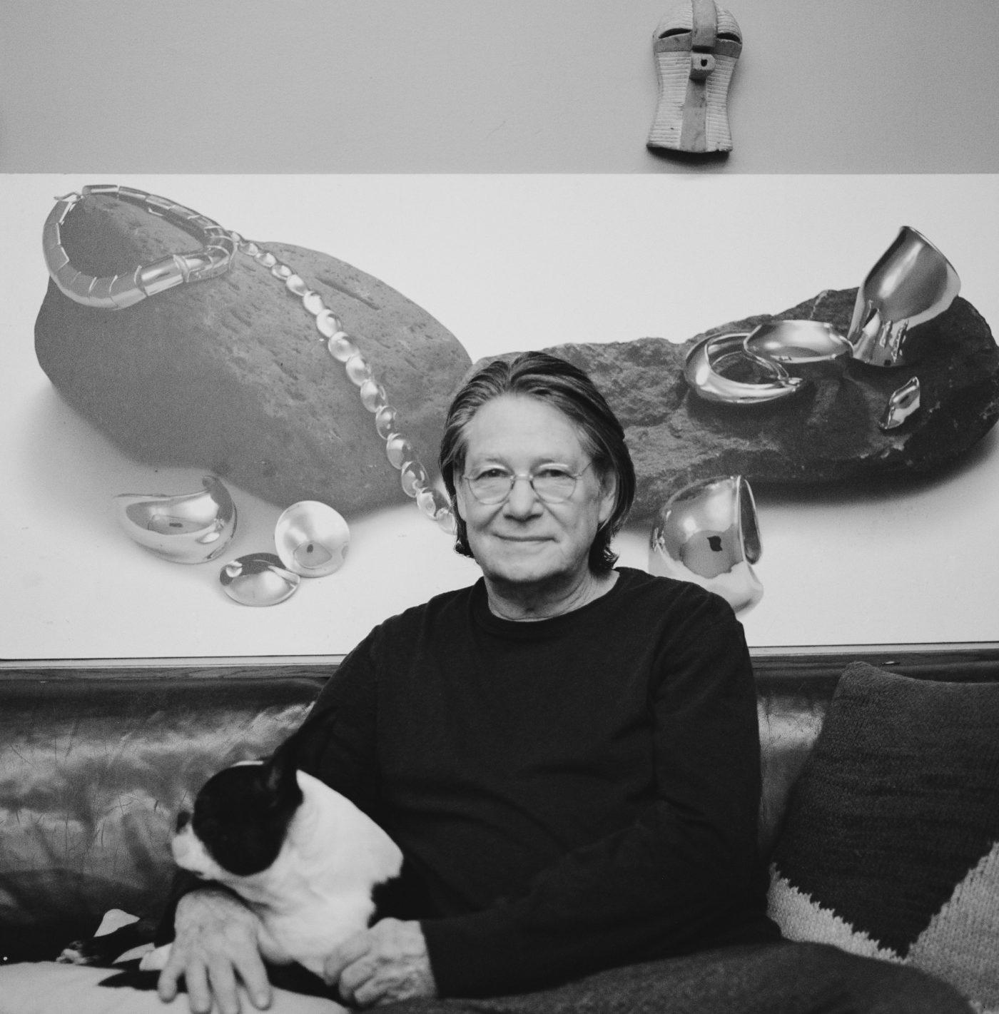
The luminous colors of Beppe Kessler’s jewelry are often paired with ordinary materials — such as elm seeds or pieces of wood — to form pieces that have an ethereal quality. A student of textile design, Kessler, who was born in Amsterdam, began her career more than 40 years ago in the visual arts. She also creates paintings and sculpture, which are often in dialogue with her brooches and necklaces. She has no formal training in jewelry, which she regards as a strength of her work.

Kessler is internationally known, with her jewelry in numerous museum collections, including the Rijksmuseum in Amsterdam, the Musée des Arts Décoratifs in Montreal, the Cooper-Hewitt in New York and the Museum of Fine Arts in Boston. In September, Kessler donated 17 of her works — spanning four decades — to the Museum of Arts and Design in New York. “We are thrilled to have Kessler as a collection artist as she is not only exemplar in the field, as evidenced by the number of awards and collections in which her work is included,” said associate curator Barbara Paris Gifford. “Her work also allows the chance to present a cross-disciplinary narrative about a designer who traverses many mediums.”

Kessler has described her work as “miniature sculptures composed of age-old and contemporary materials, brazenly combined and not bound to the traditions of jewelry making. They express my feelings and thoughts about life. They invite touching, and they tell a story.”

Jennifer Altmann: I am fascinated by the fact that you keep careful records of every piece you have created, and who owns each one. You must be very organized and disciplined! Can you describe your system, and why you take the time to maintain those records.

Beppe Kessler: Maybe it looks very well organized — it actually is — but it is also necessary to deal with the chaos in my head of working on different projects at the same time: the constant stream of thoughts about my work and preparing for exhibitions. At the start of my career, I kept all those things in my head and I perfectly knew where the work was going to be exhibited, who bought a piece, and in which gallery it stayed in consignment. And then one day you realize it occupies too much room in your head. 

In the early nineties, I start to give my work an artist number — for example, 1995 — and that was the beginning of making the books. Every work has a number, a photograph, dimensions and weight, where it is, who bought it. The books are precious to me: the work can go into the world at the moment when it is recorded and the image is in the book. It costs some effort to do this, but it also gives me rest and concentration. I always can look things up. And recently I saw the fruits of my efforts when I had to choose works for my retrospective exhibition at the CODA Museum in 2019 and asked collectors to loan pieces.

JA: Many of your pieces are named. Some of my favorite titles are Everything will be all right,” “Playboy” and Silence.” Talk about your process of coming up with titles and how they express your vision for an individual work. 

BK: Sometimes the title is first, and then I start to work. Sometimes when I am working, the title suddenly pops up. The working process is partly unconscious and intuitive. There is an intelligence in the hands. It is a constant dialogue between hands, eyes and thoughts. Material evokes thoughts you were not aware of before. The material speaks a language, and I have to listen. Material matters, such as when I found out that connecting a light material with a heavy material caused — due to gravity — a movement. The title everything will be all right was logical.

Works by Beppe Kessler. Images courtesy of the artist.

JA: Your jewelry is often in dialogue with your other main practice, which is painting. Can you give me an example of the back-and-forth that happens between the two?

BK: A year before I made the collection ocean of time I was painting, using three kinds of fabrics stitched to each other. It gave the painting a landscape-like look, a horizon, a distance. The paint makes a different structure on linen or wool, an interesting “gift” of the material. I was daydreaming about time, and the idea came to literally make time that rests in your hands.I translated the three fabrics of the painting into three materials glued together for the brooch ocean of time.

JA: Youve said you want the technique of how a piece was made to have some mystery. Can you expand on that?

BK: I do not want to make a piece that is too easy to be read, that you immediately see how it is made or from what kind of material it is made. It is not interesting at first sight. It even can be distracting. The work doesn’t deal with mere techniques or materials. Thoughts behind the work are more important.

I want people to look carefully, to be surprised, to wonder, What do I see? A technique is a way to tell something, not an end goal on its own. To master a technique is necessary, but you have to transcend the technique to write a poem with it, and that is difficult and takes time. Moreover, I want to surprise myself, to extend my abilities, to find new ways. That keeps you going as an artist.

JA: Your training is in textiles. You have no formal jewelry training. How has that affected your work?

BK: In the beginning I was unsure about that fact and thought it was a disability, something I missed. But I turned it the other way. It became my strength not to master traditional soldering, for example, or in general not to know about do’s and don’t’s.

I have to find out myself if it is possible in another way, to make my own rules, be inventive. 

It surely has affected my work. It leads to another path in many different ways — for example, by using a textile technique such as embroidery on an unusual material, balsa wood. Every time you stick a needle into the wood, the wood is destroyed, but at the same time it gets stronger because of the criss-cross threads. 

Keerpunt Turning Point, 2001; balsa wood, textile, glass, gold leaf. Image courtesy of Beppe Kessler

JA: Talk about why you choose some of the non-traditional materials you use.

BK: It started with the rubber band bracelet that I first made in 1980. You have to look twice to realize it is made from ordinary rubber bands. Years later I changed the rubber bands into O-rings because they have a longer life. But still people prefer to wear the ordinary rubber bands. 

I like to make something out of nothing. It is a challenge to work with worthless materials, humble materials found or picked up anywhere, to give them significance. In fact, the collection of brooches Signs of Life (2017-18) is also built on nothingness. 

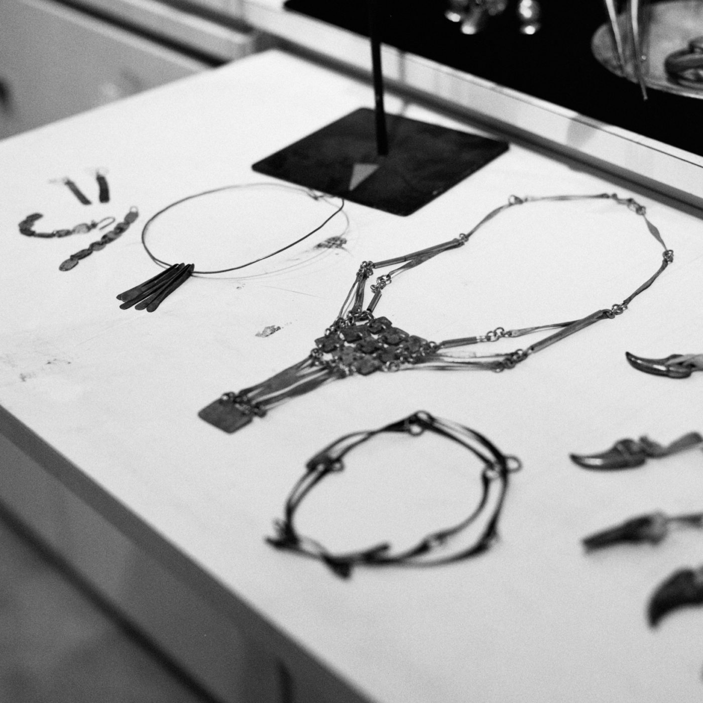
The materials I use for my compositions are often plain and of no value. It can be anything: frays, thread, slate, pieces of textile, pieces of wood. In short, that which remains. In the process of re-arranging them, I am giving them new life and meaning. 

Materials carry a wealth of meanings. They are often connected to personal memories, but in my work I am looking for a more universal kind of poetry. There is beauty in those daily things you think are worthless. Covered with acrylic, shaped as a magnifying glass, you see them with different eyes and they even get a kind of eternity. More important than beauty is that materials tell a story. It is my philosophy. Listen to the material. Material is the vehicle of my thoughts.

Another example is the necklace cycle of life. It is made of leaves, rotten leaves, elm-seeds, elm-wood, a feather and, yes, I used a gold chain, I admit, to celebrate the humble things even more.

JA: Your use of color in your recent work with brooches is very distinct. Can you talk about what you are trying to capture with those pieces?

BK: The encounter brooches, from the collection Signs of Life, are composed from three or more elements, each with different materials. Colors are very important in my work, in the paintings as well as in the jewelry. There must be a balance in the work, a balance of form, material/structure and color,but not too predictable. Sometimes I have to use clashing colors, or combine natural and artificial materials. Color always is connected by the material. Sometimes the basic color of the material is enough without adding color. Sometimes I add semi-precious stones with a clear color in the composition. 

menuet brooch, 2014; alpaca, cd, vinyl, acrylic fibre, acrylic color, wood, varnish. Image courtesy of Beppe Kessler.

 JA: Your themes often come from elements that are invisible: wind, time, warmth, nothing. What draws you to those themes, and how do you wrestle with the challenge of expressing such abstract ideas in jewelry?  

BK: I am a philosophical person. Both jewelry and painting means questioning and always raising new questions. They mark my development, an ongoing process of looking for new possibilities and inventing my own language.

Elm seed brooches, 2018. Image courtesy of Beppe Kessler.

It is fascinating to focus on the invisible forces, like wind, time, nothingness. In a very modest way, I try to answer questions about them, try to come closer to an understanding, and also try to make the work universal in a way that other people recognize something. It is not that I pretend to have a message, but it is the reason why I am an artist.


Jennifer Altmann is a freelance journalist who has written for The New York Times, The Washington Post and Art Jewelry Forum. Connect with her at jenniferaltmann.com

Our thanks to Beppe Kessler + Jennifer Altmann for bringing this dynamic conversation to Future Heirloom. Interview written and conducted by Jennifer Altmann; Image credits as noted, provided by Jennifer Altmann. Feature edited, compiled, and formatted by Jackie Andrews.

The History of Why: A Love Letter to the Unlucky Opal

The opal has always been known for its exquisite beauty, admired by many throughout time. Its rarity is based on the magnificent play of colors on its surface, with a kaleidoscopic display that is entirely unique to each piece of opal. This is just one of the reasons why it is so cherished. Working with this precious material (which, by the way, is not a gemstone, but a mineral) is not for the faint-hearted. Because of its temperamental nature, its sensitivity and fickleness, it takes a master to transform it from its rough rugged form into a polished beauty. And yet plenty have mastered this skill, for the opal has adorned many kings and queens. What is it about this extraordinary mineral that has captured the imagination of people for centuries? What is it about its magnetic energy that captivates us? This magnetic energy isn’t solely based on its physical properties but also its spiritual.

Superstition and jewelry go hand in hand. Stones and minerals have always been rumored to have magical properties, but there is a duality at play when it comes to the opal. For most of its existence, the opal was considered to be a good luck charm, rumored to lend its wearer invisible power. (And was therefore known as the patron of thieves.) And yet the myth around the opal has changed…Nowadays the opal has a reputation of being unlucky. Legend has it wearing an opal will bring you a great deal of misfortune. How did the meaning of this mineral change so drastically? In this article I will trace its history in search of the answer. 

Part of Kaouter’s collection of rough uncut opals. Image by Kaouter Zair.

Lucky, Lucky, Lucky

It is thought that the name opal is derived from the Latin word Opalus, which means precious stone. The Romans considered the opal to be a bearer of good fortune. Because of all the colors within an opal, they believed that the mineral possessed the virtues of all other stones. Pliny the Elder wrote about it in his Naturalis Historia, describing all the wonders of the mineral: “For in them you shall see the living fire of the ruby, the glorious purple of the amethyst, the sea-green of the emerald, all glittering together in an incredible mixture of light.” 

Amulet ring, Middle ages (1400); Image via The British Museum, courtesy of Kaouter Zair.

Legend has it that a Roman senator named Nonius was nearly executed because of his magnificent opal ring. It was reported to be a wonderful specimen the size of a hazelnut. This charm wasn’t lost on Marcus Antonius, who at the time was seducing Cleopatra and was in need of a jewel that could match her beauty. He demanded to buy the ring from Nonius, who was unwilling to part with his beloved opal, even with the threat of execution. He preferred to be exiled, to lose all of his earthly possessions over his cherished ring––so one can only imagine what a stunner it would have been.

The opal’s popularity grew steadily over the centuries, and the belief that the opal possessed all the virtues of other stones endured. During the middle ages the mineral was called ophthalmios, a.k.a. the eye stone, for it was said that the opal could cure any eye disease. But fast forward to the 19th century and the story of the opal changes drastically.

The gem known as a good luck charm fell out of favor, in large part due to the publication of the novel Anne of Geierstein by Sir Walter Scott in 1829. In the book, the main character wears a magical opal in her hair, which seems to change depending on her mood. After the opal comes in contact with holy water, the character is reduced to a pile of ashes and the opal, with its mixture of colors, is rendered colorless. These days, this obscure novel is only known for being at the root of this modern superstition, but at the time sales of opals plummeted, and it is from that point on that the opal, once adored by many, became feared by some. (It is also said that disgruntled diamond miners who felt snubbed by the popularity of the opal helped sustain the myth.) 

More stories fueled the superstition in the second part of the 19th century.  Spanish King Alfonso XII received an opal ring from his mistress Comtesse de Castiglione as a wedding present. They say hell has no fury like a woman scorned, and she felt truly scorned. The ring contained a stunning opal with rare coloring, and after seeing this magnificent specimen, the King’s wife Mercedes of Orleans slipped the ring on her finger. Shortly after, she died mysteriously. Grief-stricken, he gave the ring to his grandmother Queen Christiana, who also died a few months later. The next pair of hands the fatal ring fell into was his sister-in-law, who, you guessed it, died too. After all these fatalities, the King chose to wear the ring that was first meant for him. Oblivious to the chain of events, he slipped the ring on his finger, and not long after, he too succumbed to a mysterious illness…

Details from ‘The Secret of England’s Greatness’ (Queen Victoria presenting a Bible in the Audience Chamber at Windsor) By Thomas Jones Barker 1862-1863; Image via National Portrait Gallery, courtesy of Kaouter Zair.

During her reign (1837-1901) Queen Victoria did her part to reverse the opal’s bad reputation. She owned various pieces of jewelry set with opals, which are still part of the royal trust. Her love for the mineral stemmed from her love for her husband; it was said that the opal was the favorite gem of her beloved Prince Albert, who himself owned numerous badges set with opals. She was rumored to gift opal jewelry to her friends and family. This surely helped the sales of the opal, but the gem never regained its popularity. Maybe it just fell out of fashion, or maybe people really believed that the opal would curse the wearer with a great deal of misfortune. Nonetheless, this extraordinary mineral has a rich history filled with rumors, intrigue, and mystery.

To conclude, I’ll share a recent personal anecdote…For my graduation project at Sint Lucas Antwerp, I examined the opal’s relationship with luck. One of the things I created was a set of unique color collages. These self-created opals were then used in a ring to evoke good or bad luck. Lo and behold, just a couple of days before the exhibition the rings mysteriously disappeared. So you tell me, what do you think, is the opal really unlucky? I’ll let you be the judge of that…


Kaouter Zair is a visual storyteller and jeweler exploring the forgotten and lost stories about jewellery. She holds a BA and MA (Jewellery context) from Sint Lucas, Antwerp Belgium.

Naturally curious, she is driven by uncovering the reason behind things. This insatiable need to seek the obscure, has led her down many rabbit holes. She is captivated by stories that are a strange combination of facts and fiction because they tell us about our willingness to believe.

In her project: The History of Why, she delves into these wonderful stories and their rich history. She researches their forgotten origin and reintroduces these to a contemporary audience. Her work is multi-disciplinary, using the internet as her main archive.


Written by Kaouter Zair; Image credits as noted, provided by Kaouter Zair. Headshot by Saskia Van der Gucht. Feature edited, compiled, and formatted by Future Heirloom Editor Jackie Andrews in collaboration with Karen Davidov of The Jewelry Library.

Modern Masters: Robert Lee Morris

A Master of Craft

It’s not everyday you have the opportunity to meet a living legend like Robert Lee Morris. Having collaborated with some of the most iconic names in fashion such as Karl Lagerfeld and Donna Karan (to name two,) Robert built his extraordinary legacy by creating and curating the previously unimaginable. During my recent trip to the East Coast with NYC Jewelry Week, I had the opportunity to meet Robert in person at his studio in rural Connecticut. What he shared with us is a luminous, avant garde perspective, but to fully understand it we first had to dive into his past.

Casting a Hammer

Robert’s initial foray into the world of sculpture was in school through lost wax casting. “I didn’t like this medium…” he explained as he showed me one of his first bronze sculptures, “I developed this drippy aesthetic, and it didn’t speak to me. But, I had no choice at the time…the school required me to learn through this method.”

After graduating College, Robert would break free from the rigor of academic theory to form an artist commune in rural Wisconsin. It would be here, working in an almost nomadic fashion, that he received his real education – one of self-discovery and expression.

Some of Robert’s first, cold-connected works. Image Credits: Nicholas Hyatt.

“It was there [at the commune] that I taught myself how to make jewelry…” Robert explained, “…I had no money for tools so I worked with a piece of rail[road] as an anvil, a hammer, and a hand-powered drill…you know the old kind you had to hand-crank.” Pulling down a few select pieces suspended amongst his many creations, he continued, “You see, I made these very rudimentary designs from cut metal and everything was cold-forged together because I didn’t have access to a torch.” 

Despite the technical and material challenges that faced Robert at the time, you can see the foundation of genius within these early jewels which guided his work – work that would soon make him famous in the jewelry, fashion and art scenes.

Feeling the Power

After legendary Manhattan art dealer Joan Sonnabend discovered Robert, it took just a few short years for him to be transported from the rural countryside into the beating heart of 1970s Soho, and soon to the cover and pages of Vogue Magazine. “My career took off like a rocket…” he shared, “The energy of lower Manhattan pushed me into a frenzy of self-expression. I created modern body armor, bold and dramatic shapes with tremendous volume, and cinematic blends filled with sci-fi ideas and multicultural references.”

Pulling open a drawer Robert handed me a brass bangle covered in floral drops, titled “Korean Bangle,” he created for Kansai Yamamoto in 1984. Shaking my wrist, the ornament came to life, releasing its sweet ethereal tune, transporting me to a moment of pure wonder and power. Robert began, “You can just imagine it…models walking the runway with these stacked three or four high, the sound was just incredible.” “Incredible,” is an understatement—Robert’s work goes beyond making you feel confident in your skin, it makes you feel like a god, invincible.

Invincibility is at the very core of Robert’s work and is a value that clearly extends beyond his craft. In the fall of 1977, Robert took the leap of faith to open his gallery, ARTWEAR.

“Nobody could figure out how to represent my work within their stores or galleries…” he explained, “…what I was creating was too new and too far out there for people. So, I was forced to open my own space. I curated over 50 American designers, alongside my own work, in a yet-to-be-recognized category called ‘bridge’ or ‘designer’ jewelry.”

He continued:

“The publicity was instantaneous and the word of mouth business spread like wildfire. Soon all the major designers flocked to ARTWEAR to ask me for collaborations on their runway shows. For many, I was the father figure for this new category of jewelry. For myself, I was answering my calling.”

“For many, I was the father figure for this new category of jewelry.
For myself, I was answering my calling.”

– Robert Lee Morris
Top left: Polaroid of Robert’s studio. Top right: Robert flips through an item in his library on right. Bottom: Vignette in Robert’s studio. Image credits: Nicholas Hyatt.

Scaling Up 16ft.

Once immersed in Robert’s studio, you come to realize that you’re standing in a cathedral of creation. Cues to ventures past and present surround you, bifurcated reeds with brass leaves (a spur of the moment materials experiment) reach for the heavens as lamps tucked in corners with forged shades of brass glow like candles in the darkened space, hinting at his current focus.

“It all started with one…” Robert shared as we walked up to a goliath 16’ suspended structure of hand-forged brass panels painted in an ombre white finish, he continued “…I was approached by an interior designer to create a chandelier for a private client. It was so well received, I now have two more commissions.” 

Circling around the luminous sculpture, you see Robert’s masterclass of skill in full splendor. Elements of bold runway looks, golden-hued textures, and smooth figural forms reminiscent of his body casts with their white painted finish, are all warmed by the radiance of Edison-style light bulbs. Combined, they create an homage to his past and a vision of the future.

Portrait of Robert Lee Morris in his studio with one of his dogs by Nicholas Hyatt.

Editorial written and photographed by Nicholas Hyatt; all image credits belong to Nicholas Hyatt and cannot be used or republished without written consent. Find Nicholas at his site Ping Pong Ring and @pingpongring.

Our sincere thanks to Robert Lee Morris for welcoming us into his studio for this feature. Explore more from his world at robertleemorrisgallery.com and follow him @robertleemorrisgallery.

Feature edited, compiled, and formatted by Future Heirloom Editor Jackie Andrews in collaboration with NYCJW co-founder JB Jones.

The Death of America’s Jeweler

In one swift move, Tiffany & Co. has transformed from the Queen of Alexandre Arnault’s chessboard to just another Pawn in the LVMH war chest. Could Tiffany’s latest partnership announcement signal the death of creativity within this illustrious jewelry firm?

The Glasses

This weekend Tiffany’s announced their “engagement” to celebrity Pharrell Williams. However, instead of proposing with their iconic six-prong ring, Tiffany’s christened their partnership with diamond-studded spectacles. Hand-crafted in 18-karat yellow gold and set with over 25 carats of diamonds and two emeralds, these sunglasses turned heads, but they weren’t all in Tiffany’s direction.

A Sotheby’s specialist holds the Astaneh-Ye Ferdaws emerald spectacles and the Halqeh-Ye Nur diamond spectacles, October 2021.
Image via Sotheby’s.

Those who weren’t fixated on Tiffany’s announcement were seeing double while reviewing a widely publicized Sotheby’s auction held in October of 2021, particularly Lot No. 213. Romantically named, The Astaneh-Ye Ferdaws (gates of paradise), these spectacles incarnate the Islamic association with the color green with that of paradise, salvation and eternity. Adding to their poetic beauty, the emerald lenses are purported to have belonged to Shah Jahan, the 17th-century Indian ruler who commissioned the Taj Mahal for his beloved late wife, Mumtaz Mahal. According to Professor Ebba Koch of the Art Institute of Vienna, the lenses possibly served the Shah in healing his extreme mental state of mourning over the loss of his wife, providing him with a glimpse of his future eternal paradisiacal life.

The Tiffany glasses.

The Controversy

Tiffany’s branded their version of the glasses as, “custom-designed,” but their true origin is indisputable. Adding insult to injury, at the time of this writing both Tiffany’s and Williams have neglected to publicly acknowledge, or educate, their 26+ million (combined) followers on the design’s source, and cultural significance. While the creator of the original spectacles is unknown and certainly no longer earthbound, it becomes our responsibility to determine if this concept is appropriate. Is it ethical to produce a near one-for-one copy of a historical artifact in pursuit of furthering a corporate agenda? Particularly an artifact rooted in spirituality and possibly a historical figure’s grief? 

Lot 213, The Astaneh-Ye Ferdaws (gates of paradise) spectacles. Image via Sotheby’s.

A Missed Opportunity

There could’ve been a better approach to this project. Why didn’t Tiffany’s, a company which thrives off of Americana and named partnerships take this opportunity to collaborate with another American icon like Ray-Ban? It seems like the perfect chance to model a pair of sunglasses off something that might be more synonymous with American celebrity and luxuries such as the Aviators or Wayfarers.

From Queen to Pawn

I think the answer to my aforementioned question lies in plain sight. The now infamous Tiffany spectacles were used to announce a partnership with Pharrell Williams, but where did this announcement take place? Not in New York, Tiffany’s hometown and epicenter for the past 185 years. But in Paris, home to the LVMH empire; and specifically at a Kenzo (another house within the LVMH holdings) fashion show where all eyes were on Creative Director Nigo’s debut collection.

Vice President of Tiffany’s, Alexandre Arnault with Pharrell Williams at a Rimowa event in L.A.

And just like that, Tiffany & Co., an American design institution for nearly 200 years, moves from Queen of the jewelry industry, to pawn of the conglomerate LVMH – pushed around the board to further a self-serving agenda designed to build and elevate its holdings’ reputations.

Is The Queen Dead?

We’ve (recently) been here before with Tiffany & Co. but it now appears to be a trend, and I have a feeling that our closely-knit industry will become tired of this continued game of corporate copycat. While I doubt the Tiffany name will ever cease to exist as a result of these actions, I can’t help but wonder something, “will creativity ever return to 610 5th Avenue?”

I certainly hope so. I have to say, it’s sad to see a company that was once synonymous with a unique expression and forward-thinking design engaged in the lowest form of creative production. The Queen may not be dead yet, but she’s certainly on life support.


Editorial written by Future Heirloom correspondent Nicholas Hyatt, excerpted from original publication on Hyatt’s website, Ping Pong Ring. Images provided by Nicholas Hyatt. Edited and formatted by Future Heirloom Editor Jackie Andrews.